Assets Overview
The decision surface for browsing tokenized assets: comparing signals and taking the right action — stake, sell or borrow — without losing your place in the catalog.
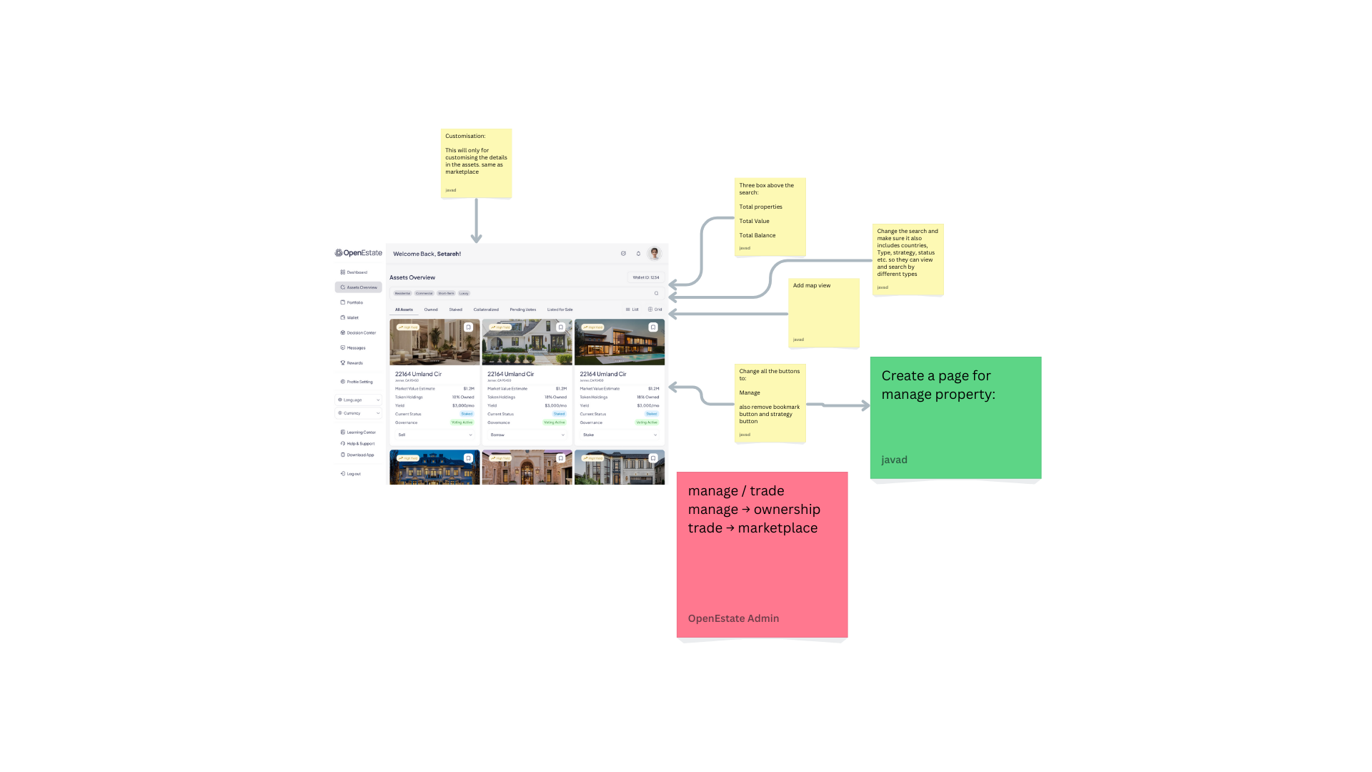
Users need a fast way to browse assets, understand investment signals, and take context-specific actions — Stake / Sell / Borrow — without jumping across multiple pages or losing their place in the catalog. This page is the decision surface: it affects discovery, comparison, and conversion into action (open details, stake, list for sale, governance participation).
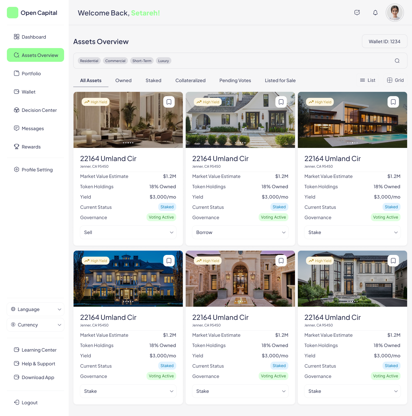
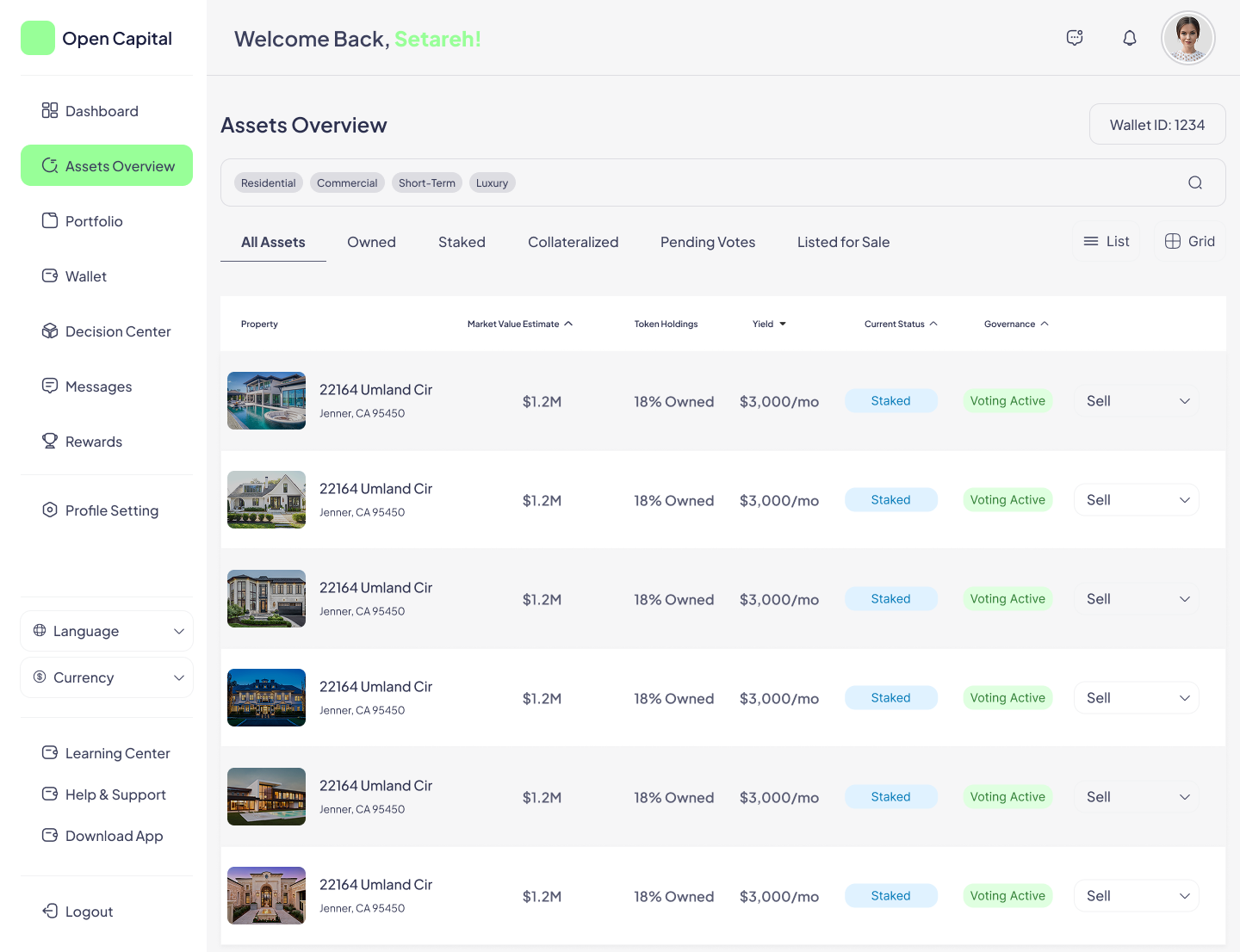
The design combines category filters (Residential / Commercial / Short-Term / Luxury), ownership segments (All Assets / Owned / Staked / Collateralized / Pending Votes / Listed for Sale), grid and list view modes, and a primary action per asset card that adapts to its current state.
- User goals — find relevant assets quickly, compare them reliably with consistent metrics, understand ownership/status at a glance, and take the correct action for each asset's state.
- Business goals — increase qualified engagement (asset opens, watchlist usage), increase action initiation (stake/sell/borrow) from the overview page, and reduce support questions around “status”, “yield” and “governance”.
- UX metrics to track — time to first asset open, task completion rate (find + compare + act), filter/segment usage rate, action initiation rate, and self-reported decision confidence.
- Return Investor — checks portfolio status, staked/collateralized assets, governance.
- Opportunity Hunter — searches for high-yield opportunities and compares multiple assets quickly.
- Risk-Aware Investor — wants clarity on what “status” implies before acting.
“When I open the dashboard, I want to see which assets are relevant to me, so I can decide what to do next.” “When I compare assets, I want consistent metrics and labels, so I can make a confident decision.” “When I'm about to stake/sell/borrow, I want the UI to clearly signal constraints and consequences.”
- Cognitive overload — too many metrics per card reduces scan speed.
- Ambiguous statuses — “Staked” vs “Collateralized” can be misunderstood.
- Inconsistent comparability — if cards don't prioritize the same signals, users compare incorrectly.
- Action mismatch — showing “Sell” or “Borrow” without clear eligibility can create errors or distrust.
Hypotheses tested against the design: a grid view is better for discovery while a list view is better for comparison; users need segmentation by ownership/status to reduce irrelevant noise; the overview page should surface one dominant metric (Yield) and keep the rest secondary.
Content is grouped into navigation + identity, filtering & segmentation, catalog results (grid or list), and per-asset actions. A priority model governs what leads visually:
- Primary — asset name + location, status (current status + governance), yield (the North Star metric), and ownership indicator.
- Secondary — market value estimate, strategy tag (e.g. High Yield).
- Tertiary — extra details such as area, tags and minor attributes.
The two view modes side by side — grid optimized for scanning and shortlisting, list optimized for reliable comparison across many assets.
- Consistent numeric formatting for currency, thousands separators and yield units.
- Clear units and period labeling (e.g. “3,000/mo” vs. an annual figure).
- Color is never the only indicator — chips and labels carry meaning alongside color.
- Keyboard navigability for toggles and filters, with clear empty and eligibility states for every action.