Marketplace
The primary discovery layer of a tokenized real-estate platform — where users move from browsing to evaluation, then to intent: save, open details, invest.
Open Estate is a tokenized real-estate investment platform where users discover properties, compare performance indicators, and invest through token-based ownership. I owned the Marketplace experience end-to-end — from information architecture and interaction patterns to UI detail, states, and design-to-dev handoff.
Tokenized real estate introduces a unique decision-making context: users aren't only choosing a property — they're choosing an investment profile (yield vs. growth vs. strategy). The marketplace has to support both fast scanning and deep comparison, while keeping high-density information (APY/yield, price per token, total tokens, availability, location, tenure) readable and trustworthy.
- Increase discoverability of relevant opportunities through faster filtering and clearer categorization.
- Support comparison-first decision making for analytical users, without overwhelming casual ones.
- Offer multiple exploration modes — visual, data-dense, geographic — with a consistent information hierarchy.
- Build a filtering system that scales as strategies, geographies and asset types are added.
- Find properties by strategy, location, price, type and availability.
- Compare investment metrics across options.
- Switch between grid, list and map without losing context.
- Confirm what “price” means — token price vs. whole-property price.
I benchmarked products with strong patterns in discovery, filtering and comparison-heavy browsing — not to copy UI, but to extract proven interaction models (filter hierarchy, multi-view browsing, table density, map behaviors) and adapt them to a domain where clarity and trust matter as much as speed.
Before high-fidelity UI, I mapped the marketplace structure through low-fidelity sketches to validate information hierarchy, navigation between grid/list/map, and filtering logic — surfacing trade-offs early and reducing rework during implementation.
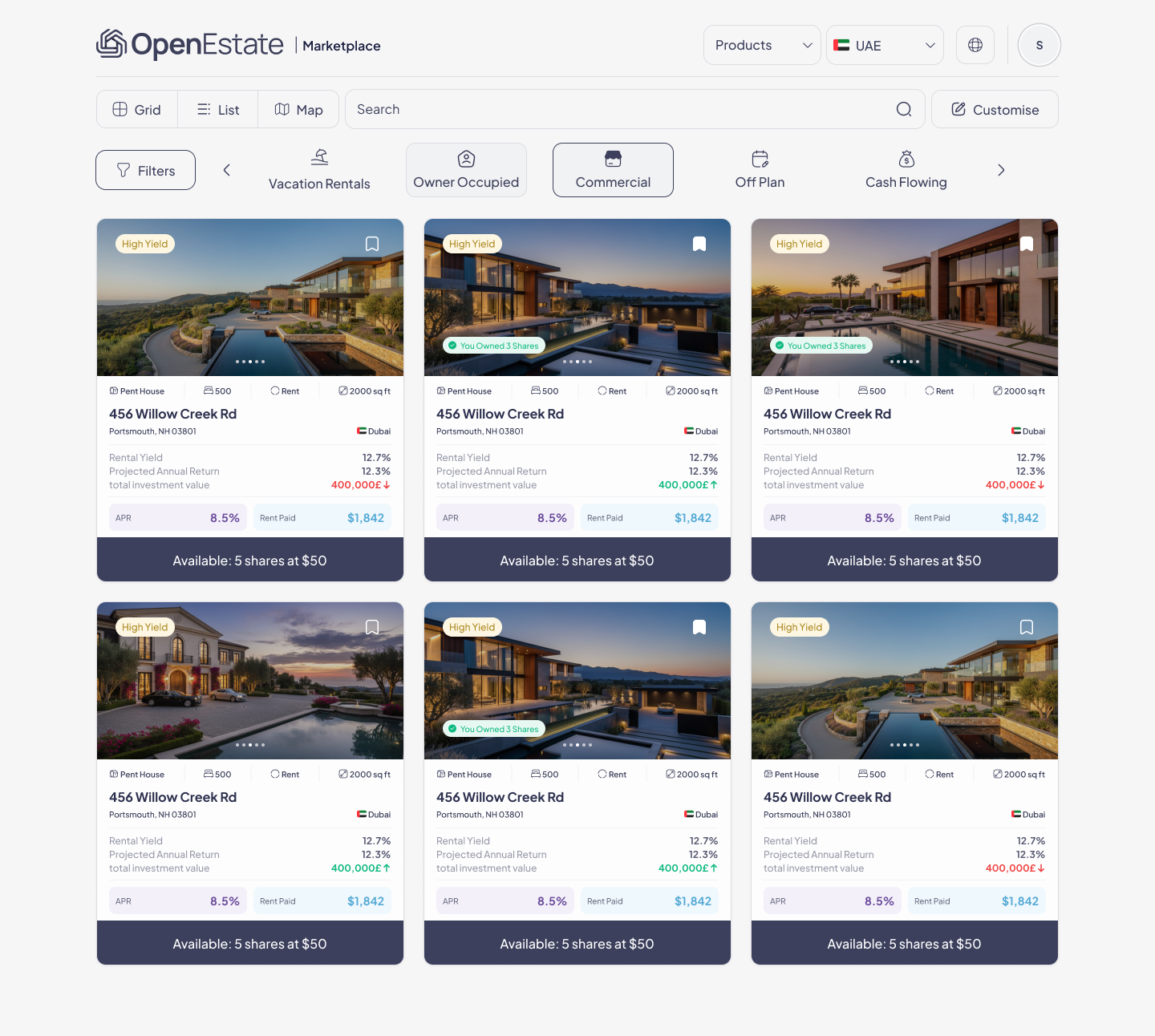
Grid view — visual discovery. Optimized for scanning and shortlisting: the card prioritizes image + identity (name, location, type), investment cues like “High Yield” read as tags, and a consistent metrics area highlights yield/APY, rent paid and availability at a glance.
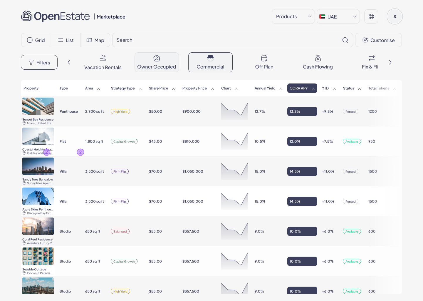
List view — comparison mode. A table-style layout for power users and repeated evaluation: columns focus on high-value attributes (area, strategy, share price, property price, annual yield, APY, YTD, status, tokens), with a small trend chart column for context without a separate analytics page. It reduces cognitive load by aligning metrics into predictable columns and supports “compare-many” behavior.
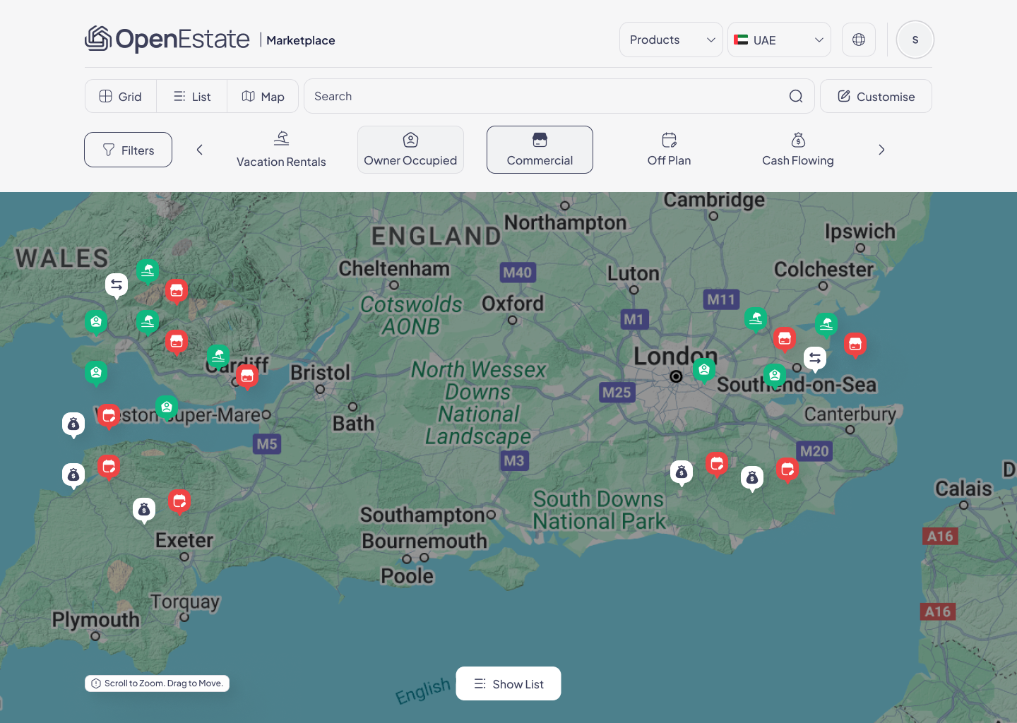
Map view — location-led exploration. Users explore regions and clusters visually rather than guessing which location filters to apply; a “Show list” action bridges back to inventory browsing once they're ready to compare. It supports a different mental model — start with place, then refine.
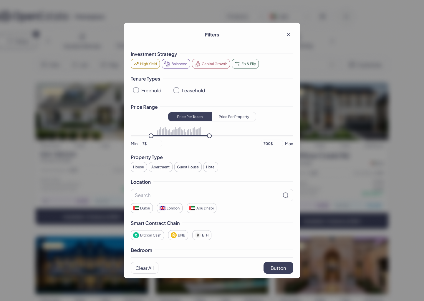
Filters modal — scalable decision controls. A structured, extensible control set: investment strategy (High Yield / Balanced / Capital Growth / Fix & Flip), tenure type (Freehold / Leasehold), and price range with an explicit toggle for price-per-token vs. whole-property price.